802 Credit Union
Better. Together.
Members Advantage Credit Union and River Valley Credit Union, both based in Vermont, merged to form an entirely new institution. In a market crowded with credit unions and community banks, it needed a new name and strong brand identity to stand out from its competitors and convey the benefits of the combined entity to members and prospects.
BRAND WORKSHOP
Finding Uniqueness
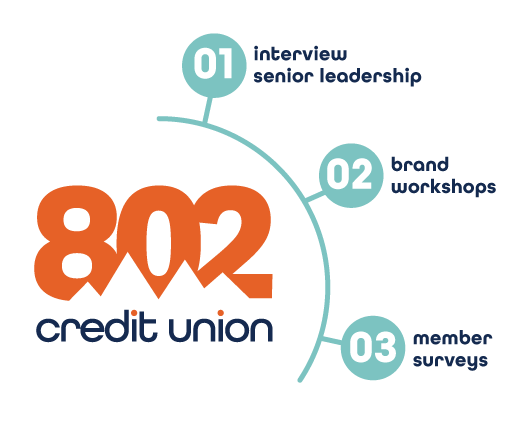
We began by working to identify the institution’s unique advantages. After interviewing señor leadership, we held a series of Stackpole-PPG Brand workshops with employees. We then conducted member surveys to see how well the internal value proposition matched the views of the larger community. We also completed a thorough competitive analysis. Based on these findings, we set out to create the new identity, branding, logo, and other materials.
Vermont
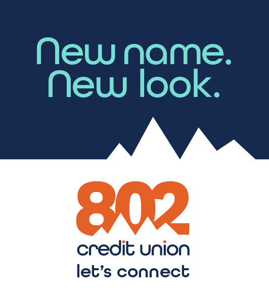
Welcome to 802
It’s Vermont’s only area code, and a powerful way to communicate that the entire state is eligible to join. The tagline, “Let’s Connect,” helps convey that the new 802 Credit Union is neighborly, welcoming, and eager to help members meet their financial challenges. The bright orange and blue color scheme stands out boldly in the Green Mountain State, where most competitors employ a more muted, earth-toned palette.
BRAND GUIDELINES
A Distinctive Brand Voice and Identity
We also created comprehensive brand guidelines to govern the design of all internal and external communications. The ad campaign used a striking graphic approach with brief copy to announce the merger and highlight the superb member service, enhanced resources, and expanded branch footprint. The result: strong brand differentiation, and a truly unique voice and identity in a highly competitive market.