Ledyard Bank: A Unified Brand for a Fragmented Market
Challenge
Despite a legacy of trust and service, Ledyard Bank faced a shifting landscape. Larger banks and fintechs were dominating digital engagement. Gen Z and Millennial consumers—mobile-first, fee-averse, and app-happy—were rapidly building personal banking ecosystems around convenience, not relationships. Traditional community banks like Ledyard were rarely even in the consideration set.
To compete, Ledyard needed to not just update its look—it needed to act the part of a digital-first, future-ready brand. The question wasn’t just how to look modern. It was how to be modern—without losing the trust and equity of the Ledyard name.
Strategy
We started with a clear mission: modernize the Ledyard brand while preserving its heritage. That meant more than a logo refresh. It meant a full reset of brand architecture, visual identity, digital experience, and tone of voice—anchored by a new sub-brand tailored to digital-native audiences.
Our strategy unfolded across three tightly integrated initiatives:
- Brand Refresh
- Evolved the logo and identity system for digital channels
- Expanded the color palette to reflect optimism and accessibility
- Updated brand standards for consistency across all touchpoints
- Developed a new positioning tagline to express the “One Ledyard” brand vision
- Website Redesign
- Rebuilt from the ground up to serve a modern, mobile-first audience
- Simplified navigation, boosted SEO, and integrated interactive tools
- Created a clear path to conversion with stronger CTAs
- Refined content and voice to connect with Gen Z and Millennial users
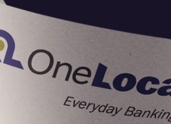
- Launch of Onward — A Digital Banking Sub-Brand
- Introduced Onward, a seamless mobile banking app that pulls budgeting, payments, credit monitoring, and savings into one intuitive experience
- Built a brand around speed, control, and simplicity to match Gen Z’s expectations
- Ran a multi-channel campaign across Meta, SEM, and OLV using irreverent, bold messaging
- Positioned Onward as the antidote to app overload and big-bank bloat
Execution
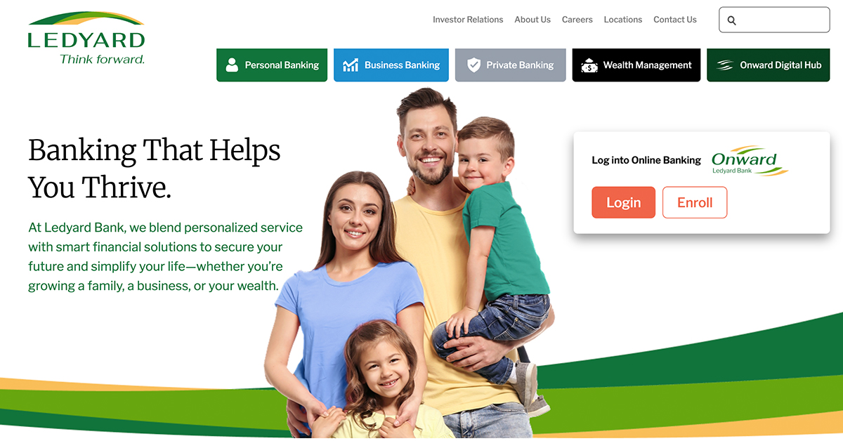
Visual Identity Refresh
A refreshed logo and visual identity introduced new vibrancy and digital fluency, while remaining rooted in Ledyard’s established equity. New guidelines enabled flexible use across digital platforms, merchandise, and corporate materials.
Tagline Creation
We retired “Plan Well. Live Well.” in favor of a more active, confident positioning—aligned to “One Ledyard” and the spirit of forward momentum.
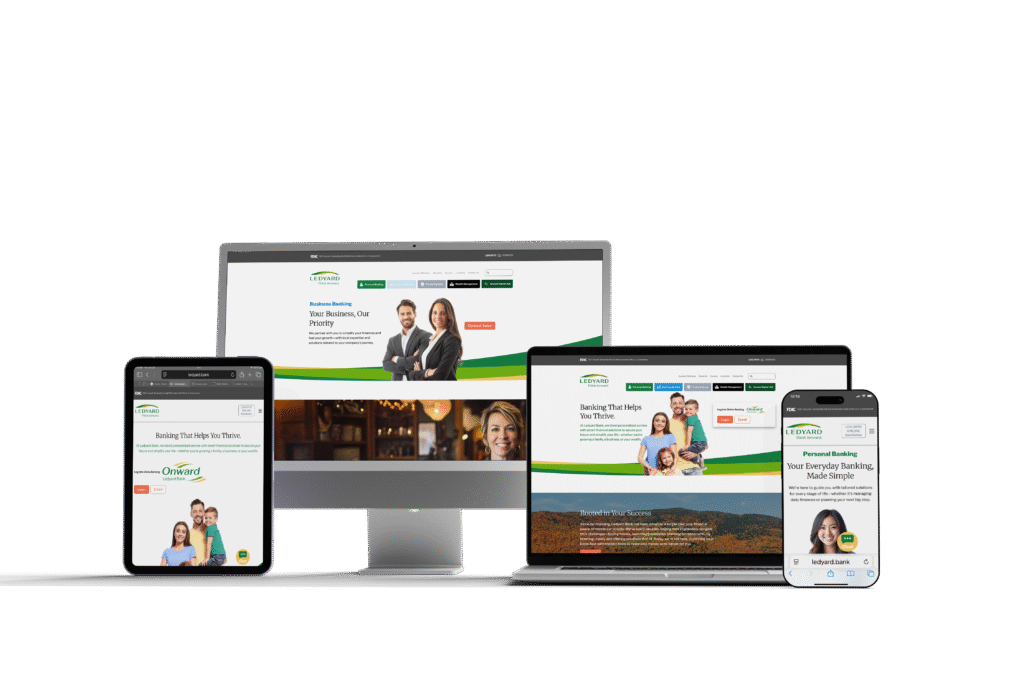
Digital Experience Overhaul
The new website experience focused on utility and UX: simplified dropdowns, accessible navigation, ADA compliance, responsive design, and built-in tools like calculators and live chat.
Campaign Concept: “Why Wait to Switch?”
For Onward, we focused on inertia—the biggest barrier to switching banks. Real-world metaphors (cracked phone screens, bloated app folders) dramatized the pain of old habits and made the case for one seamless app. The tone was cheeky, direct, and mobile-native.
Messaging Pillars
- Total Financial Control, in One App
- Safety That Doesn’t Sleep
- Made for Now (and What’s Next)
- Ditch the Fees. Keep the Freedom.
Results
- The campaign just launched in May 2025, but early signals are strong:
- App downloads ahead of projection by 28% in the first three weeks
- Website engagement up 42% with a drop in bounce rate and higher CTA interaction
- Social engagement (Meta) doubled benchmark click-through rates on carousel and OLV placements
Why It Matters
This wasn’t just a new look. It was a leap forward in how a respected regional bank shows up in a mobile-first world.
Ledyard didn’t abandon its legacy—it activated it. And with Onward, it built a platform not just for digital banking, but for future relevance.